Like most of our experiments, this one started as a test of a new model. We wanted to see how far Claude Fable 5.2’s eye for design really goes, and a typeface seemed like the hardest fair exam we could set: it is made entirely of code, and it is judged entirely by looking.
We walked in with a clear picture of what we were after. The letters should recall the terminal fonts of old machines while still looking clean and modern, fitting a tech company with years of tradition behind it and its principles aimed squarely at the future. We also brought decent taste and a working grasp of typography, though at one point we did have to ask Fable to explain kerning to us a second time. What we lacked was any idea how to write the code. Getting a script to emit a valid font file is one problem; getting it to draw letters that are genuinely pleasant to read and carry all of that character is a much harder one.
We had a practical motive, too. We wanted a single font to spell out Gallop Systems in our logo and set every heading and title on the site, putting our name and everything beneath it in one hand. Until last week, this site ran on IBM Plex and Plus Jakarta Sans. Good fonts. Not ours.
You are already looking at what came out of those two days in every heading on this page, in the corner logo, and in the lines below, which are plain typed text rather than an image.
Gallop Systems
Custom software that fits how you work.
Payroll, done. 1,204 invoices / $86,300 @ 0%
We worked in a strict sequence, starting with principles, moving on to the alphabet, and saving the playful parts (ligatures, a logo you can type, and a horse on the keyboard) for the very end, where they belong. Across both days, the working loop stayed the same. We described what we wanted; Fable wrote the code, rendered a proof sheet, critiqued its own sheet, and showed us the result; then we pointed at whatever still looked off. A person chose every shape on this page, and a script drew every curve.
Why make a font at all
About a dozen letters in, we stopped to ask ourselves out loud why we were making a typeface in the first place. Was it for control over display, for recognizability, or simply because we could? We wrote down our real reasons and ranked them so that whenever two design instincts pulled against each other later on, the higher reason on the list would win.
- Made the Gallop way. The typeface is a small piece of software written in code, with a handful of rules, shared parts across letters, and every weight generated from one source. We wanted it built the way we build software, and we wanted that discipline to show. Every curve has to be explained by a rule, with zero hand-drawn exceptions.
- Consistency. Every character obeys the same geometry, and everything we publish speaks in one visual voice.
- Recognizability. A reader should be able to spot a Gallop heading even without the logo beside it. Distinctive shapes are welcome whenever they grow naturally out of the rules, and off-limits whenever they break them.
- Control. Whenever we need a new glyph, another weight, or a fresh logo variant, we can generate it the day we need it.
That ranking did real work later on, especially putting number one at the top.
Eleven letters, three directions
Spelling Gallop Systems takes eleven distinct letters, which gave us a small, fast set for our first proof sheet. We drew those eleven characters three ways on top of a shared skeleton. Facet clipped its corners like the flat planes of our low-poly horse, Round used full bowls and round stroke ends, and Track squared off the curves with flat terminals.
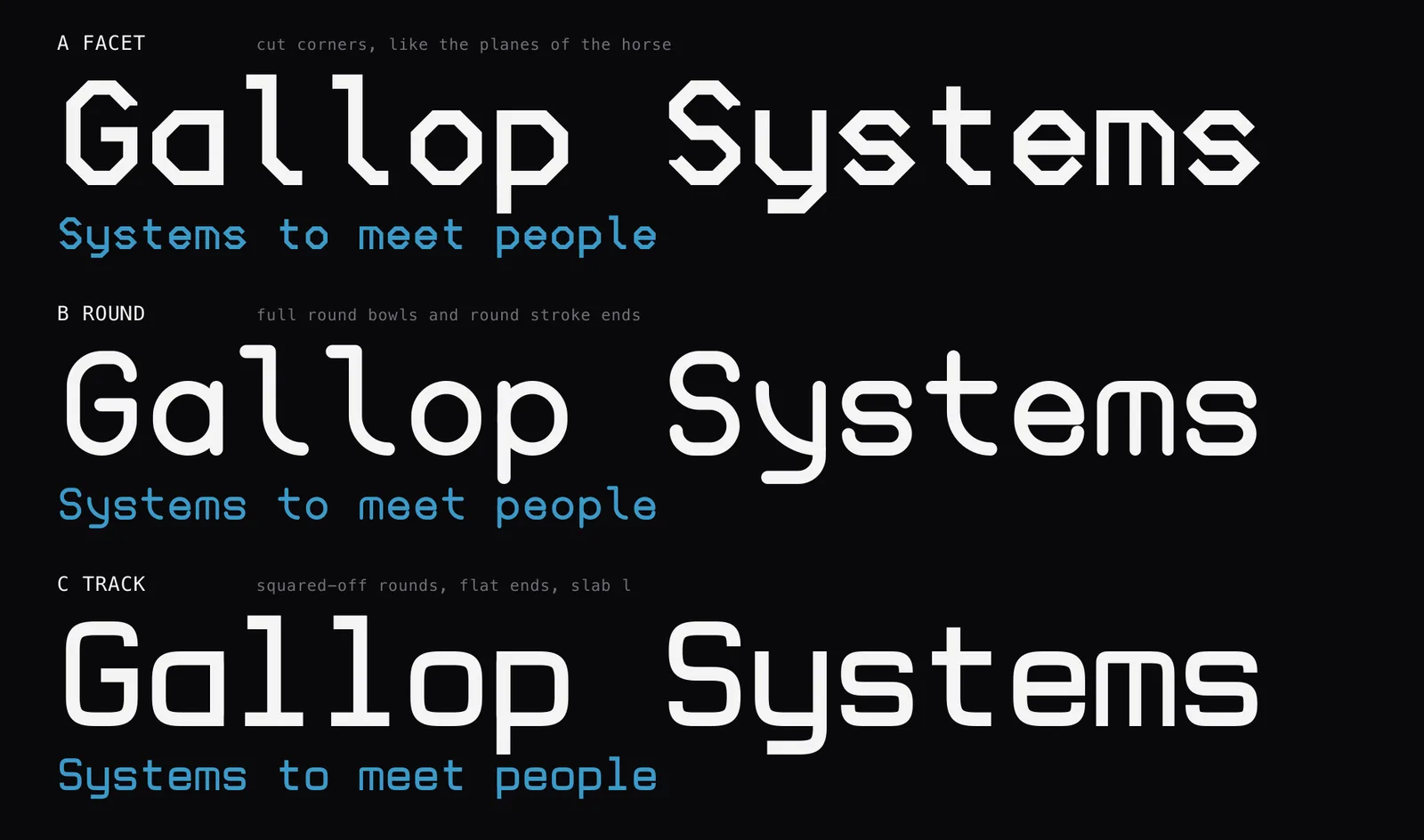
Starting on a monospaced grid was deliberate. Fixed-width letters immediately read as technical, and a short wordmark is forgiving about rigid spacing.
We liked Round best, with one complaint attached. On the page, it looked “a bit too comic sansy” to live with. So the next several sheets walked Round steadily toward Track. We kept the generous bowls, sliced the stroke ends flat, and tightened the corners step by step until the softness left the shapes. Eventually we settled between two of those blends, then split the difference one last time. The winner carried a name only a spreadsheet could love (M2) and one defining trait that shaped everything after it: none of its curves are circles.
One bent pipe
From M2 onward, a single physical image guided every character in the font. Picture each letter bent out of one pipe of constant thickness. Whenever the pipe turns, it follows a rounded-square curve that avoids both true circles and sharp corners. Wherever the pipe ends, it is cut flat.
Each letter is a few center lines (blue). The script thickens them into outlines (gray). The r is the n’s own line: the outline simply stops early. Click the letters to watch it again.
That mental model grew into eight rules, with six of them doing the heavy lifting across the alphabet.
- One stroke weight. Within any weight, every stroke shares the exact same thickness. Without thick-and-thin modulation, no character looks heavier or paler than its neighbors.
- Rounded-square curves. Bowls run nearly straight along their sides and flatten across the top and bottom, turning the o into a softened rectangle.
- Flat ends. Every open stroke stops cleanly with a flat cut, free of round caps or sharp points.
- Square leaving a stem, round on the turn. Where the arch of an n leaves its vertical stem, it branches off at a crisp square corner before rounding smoothly over the shoulder.
- Letters built from each other. Related characters reuse the same underlying pieces so their family resemblance shows on the page.
- Curves before diagonals. Whenever a letter can be drawn with an arch instead of an angled stroke, the arch wins. Our capital A is an upside-down U with a crossbar.
You can see the shared-parts rule at a glance without reading a line of code.
h is n with an ascender. r is n cut short. m is two n arches. u is n turned over, y is u with a tail, w is m turned over. b, d, p, q, a and g share one bowl. 9 is 6 turned over. C is the O with a gap, and G is that with a spur. A blue copy is the letter being reused. Click to watch it again.
Most of our debates centered on how far to push that reuse. We had to decide whether an r was truly an n cut short or the top of a c mounted on a stem (cut short won), and whether flipping n into u meant mirroring it horizontally too (we left it unmirrored). Lowercase m took several rounds all on its own. Flattening it across the top made it read like a heavy bar, while leaving the top open created a middle edge that clashed with everything around it. Our shortest review note of the whole project set the standard: the thickness “needs to be consistent (everything needs to be consistent 🙂)”. In the finished m above, two arches meet on the middle leg and round away to either side, keeping every shoulder the exact weight of its neighbors.
Writing down the design language
Partway through the alphabet, judging individual letters one at a time stopped working. Asking whether we liked a particular g mattered far less than knowing what the typeface’s design language actually demanded. So we paused the drawing script and wrote that language down in full, covering the bent-pipe model, all eight rules, the proportions, a short list of allowed exceptions (a percent sign simply cannot fit two rings and a slash into one cell at full stroke weight), and a log of settled decisions with the reasoning behind each, so that we don’t have to keep revisiting why a specific letter looks the way it does.
The rules never replaced taste, though. They narrow the field without picking the winner. Both versions of the u we considered followed every rule, and so did all three versions of the m. Only one of each looked good, and choosing it was still our job.
Putting those rules into a standalone document changed our pace, because we could hand the spec to fresh eyes. We sorted the alphabet into six groups of look-alikes (bowls, arches, straight strokes, diagonals, S-curves, and marks) and gave each batch to a separate AI reviewer with one instruction: judge every character against the spirit of the design language. Between their reports and our own second pass, our fix list filled up with the small flaws you go blind to after staring at proof sheets for an hour. The arms on E, F, and L stopped half a stroke short. The flag on the 1 tapered to a sharp point in a font that bans sharp points.
We also showed the document to a different model entirely, Google’s newest and most advanced, Gemini Hydrogen, and asked what it made of our capital M and W, which at the time were built as round arches. It pointed out that while both letters obeyed the letter of our rules, two of those rules were colliding inside a narrow cell, and in running text the arched M blurred into our arched A. We rebuilt M as two upright stems joined by two diagonals in one continuous pipe, then turned it upside down to make W. Leaving A and U as the sole arched capitals gave all four letters room to read clearly.
Not every fix landed on the first try. One pass meant to keep the 1 and the 7 apart drew a blunt verdict in review: “dude. the 1 and the 7 are not just separated, they are divorced.” The two have since reconciled.
From Mono to Sans
Gallop Mono came first, and all three weights of it remain part of the family. Still, locking every glyph into an identical cell forces compromises. Narrow letters have to sprout flags and tails just to fill their box, while wide ones get pinched to fit inside theirs.
Gallop Sans uses the exact same drawings with the fixed-cell rule lifted, giving each letter the width its shape asks for. Freed from the box, i and j drop their flags, m opens up into two full arches, and the numerals keep a shared width so columns of figures still line up cleanly.
Minimum illicit willow
Mono: every letter gets the same cell, 600 units wide. The i and l grow flags and tails to fill theirs; the m and w are squeezed into theirs.
Minimum illicit willow
Sans: each letter gets the width that fits it. Same strokes, same weight; only the boxes change.
Proportional widths immediately require kerning, the pair-by-pair spacing nudges that keep a word like “To” from splitting in two. We never sat down to kern pairs by eye. Instead, the script scans horizontal rows between every pair of letters to measure the open white space between them. Whenever a pair traps more air than our baseline “nn” and “oo” pairs, the script pulls the two letters closer by a fixed share of that surplus, closing at most a third of their narrowest gap and stopping well before the strokes crowd. Because lighter strokes leave more open air around themselves, each weight runs its own pass, producing roughly 2,600 kerned pairs in Light and about 1,600 in Bold. Only a handful of pairs where pure geometry misses a reading hazard are set by hand, each with its reason written beside it; an r before an n, for instance, must never blur into an m.
Click the switch to take the kerning out and put it back.
Eighteen ligatures from one rule
A ligature is two or more letters drawn as one joined shape, like the fi in most book fonts. Type designers usually draw each one by hand.
By this stage, refusing to draw special cases had become a reflex. When we saw that neighboring f and t stems wanted to share a crossbar, drawing a custom “ft” glyph by hand felt wrong. Instead, we wrote one rule into the build: neighboring crossbars at the same height merge into one pipe.
All eighteen ligatures follow straight from that sentence. Any run of f and t characters links across a single bar. Place an i after an f and that crossbar extends to form the i’s top flag; follow it with a t and the same pipe continues right across, which is how a custom-software shop ends up with a ligature for “fit.” Meanwhile, two l’s side by side stay two separate letters. We tried joining them once and tossed the attempt out once we saw it was a visual trick in a font built on rules.
Click the switch to pull the crossbars apart and join them again.
The wordmark, in stride
Once the font was finished, making the wordmark came close to simply typing our name. Before calling it done, we asked whether a ligature, letters joined into a single shape, could subtly suggest a horse. Looking closely at gallop, we saw the answer was already waiting in the individual letters: the word has legs. The tail of the g kicks backward below the baseline, while the two l’s reach forward along it. Give the stem of the a that same forward tail as the l (three hooves reaching ahead) and bend the descender of the p into a backward kick matching the g, and you have four legs and a tail, caught mid-stride.
Click the switch to put the letters in stride. It turns on stylistic set 1 (ss01); with it on, “gallop” in Bold is the logo’s first line, outline for outline.
Those legs also explain why our mark stays lowercase. All the motion lives in the lowercase stems and descenders, and the sweeping tail under the g opens a natural pocket for the smaller “systems” to tuck beneath.
One earlier logo idea died on the table because of ranked reason number one. We liked how a capital G can suggest an upward-pointing arrow and sketched a few trials, none of them convincing. Eventually we admitted why: it might not be possible without breaking all the rules, and a logo letter that can’t be explained by the font’s own rules is exactly what our top principle forbids.
Instead of leaving the kicking a and p trapped inside a static logo file, we built both shapes straight into Gallop Sans as stylistic alternates. They stay switched off by default so ordinary text keeps its plain a and p. Flip on stylistic set 1, type “gallop” in Bold, and you get the exact wordmark on the spot. We checked every letter’s position number for number against the logo file.
A horse on the keyboard
At that point, the horse emblem was the lone piece of our logo that still lived outside the keyboard.
Alongside the typeface, we redrew our galloping horse in the same pose as our older mark, rebuilding it from flat low-poly facets across five shades of blue with motion dots trailing off the mane and tail. It remains the one piece of our visual identity drawn outside the eight pipe rules. Still, a font file can carry plenty more than letters, so we packed the horse into Gallop Sans as well.
gallop
Built by Gallop Systems, in two days.
Payroll, done.
Select the text: the horses are characters. The big one is the logo’s horse, placed where the logo places it. The small one stands on the baseline, as tall as an l. The white one is the same shape in the text color.
We included two sizes because the logo’s horse stands taller than a line of text, and two colorings because sometimes you want the five blues and sometimes you want a white horse on a blue button. The full-color marks use layered color glyphs; anywhere color fonts lack support, the same character automatically falls back to its solid silhouette so it never renders as a blank box.
And naturally, if you type the standard horse emoji in Gallop Sans, you get our horse.
The same pipe, right to left
After this article first went up, we gave the rules a harder test: an alphabet they were never written for. Gallop Sans and Gallop Mono now set Hebrew and Yiddish, with all 27 letters bent from the same pipe at the same three weights. The rule about letters built from each other got stricter on the way over. Every Hebrew letter had to be a sibling of another Hebrew letter, and a part that existed only in the Latin stayed out. So כ lends its rounded back to ל, מ, ק, and ס; ו is the stem inside י, נ, ג, and ן; and a single arch carries ח, ה, ת, ר, and ם. Above and below the letters sit the vowel points, each one anchored to its letter by the font, and beside them the letters Yiddish adds: אַ and אָ, װ and ײ, פּ and פֿ. Mono kept its old habit, too. ו, ז, ג, and ן are too narrow for the cell, so they grow the same flags and tails as the Latin i and l. The Yiddish name gallops, too: the same stylistic set that puts gallop in stride gives ג a tail kicking back and sends each א and the פ reaching forward, which here means to the left, because the word runs that way. Everything in the card below is typed text.
גאַלאָפ סיסטעמס
סאָפטװער, געפאַסט צו אײערע געברויכן
The alphabet, with the five final letters, in Bold, Regular and Light.
א ב ג ד ה ו ז ח ט י כ ך ל מ ם נ ן ס ע פ ף צ ץ ק ר ש ת
א ב ג ד ה ו ז ח ט י כ ך ל מ ם נ ן ס ע פ ף צ ץ ק ר ש ת
א ב ג ד ה ו ז ח ט י כ ך ל מ ם נ ן ס ע פ ף צ ץ ק ר ש ת
The Yiddish letters.
אַ אָ בֿ וּ װ ױ יִ ײ ײַ כּ פּ פֿ שׂ תּ
The points: the vowels, the dagesh, the rafe, and the shin and sin dots.
בְ בֱ בֲ בֳ בִ בֵ בֶ בַ בָ בֹ בֻ בּ בֿ שׁ שׂ
שָׁלוֹם עֲלֵיכֶם
אבגדהוזחטיכךלמםנןסעפףצץקרשת
Mono: one cell each, read from the right. The third, sixth, seventh and seventeenth letters (gimel, vav, zayin, final nun) carry the flags and tails.
The Hebrew also showed us where the model’s knowledge thins out. Fable 5.2 plainly knows Hebrew letters far less well than Latin ones. When we decided that shin and ayin should come from the same family of shapes, it gave the shin a tail. Told to take that tail off, it offered to take the ayin’s off as well. So in a way, this part of the project laid bare the three things this kind of work takes in the age of AI: a model that can do the job well (here, writing the code that draws a typeface), a way for it to check what it made (here, Fable 5.2’s excellent eye for a rendered proof sheet), and a domain expert, who matters most when the model is working in a niche where its training data is sparse.
What we’d tell someone doing the same
Write your rules down while the alphabet is still small, and rank your reasons for building it. Nearly every hard call over those two days was settled by pointing to a line in our design language rather than trusting our mood in the moment. The one time an appealing idea clashed head-on with the rules, over that arrow-shaped G, the rules won, and the wordmark is stronger for it.
Treat the font as software. Because ours is a script, refining the arch on n updates h, r, m, u, y, and w across three weights and two families in the time it takes the build to run. Rolling out the finished fonts on the site you are reading meant replacing three files.
Finally, leave the last 10% for play. Strictly speaking, nobody needs a ligature for “fit” or a horse tucked into the character set. Still, no word gets typed around a company more often than its own name, and now whenever we type ours, it gallops.